How to Maintain Brand Consistency Across AI-Generated Product Photos
Inconsistent product photos scream 'amateur.' Here's how to use AI tools to maintain a cohesive visual identity across hundreds of images.
Why Brand Consistency Matters More Than Ever
Customers scroll fast. If your product images look like they came from three different photo shoots (they probably did), your brand feels fragmented and untrustworthy. Consistent imagery builds recognition, trust, and perceived value.
The data supports this: brands with consistent presentation across all platforms see revenue increases of up to 23%. And in the AI photography era, consistency is actually easier to achieve than it was with traditional shoots.
The Three Pillars of Brand Consistency in AI Photography
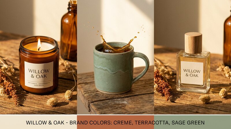
1. Brand Colours
The most impactful consistency lever is colour. When your product images share a common colour palette in backgrounds, props, and accent elements, they create a cohesive visual story.
ShopShot lets you set brand colours as account defaults. Once saved, every AI-generated lifestyle shot incorporates your palette - your signature blue appears in backgrounds, your accent gold shows up in props. It persists across sessions so you never have to re-enter it.
- Primary colour: Your dominant brand colour (appears in backgrounds and major elements)
- Secondary colour: Supporting colour for accents and details
- Accent colour: Used sparingly for visual interest and highlights
2. Style Presets
Choose one style preset and stick with it across your entire catalogue. If you sell artisan products, "Rustic" creates warm, natural imagery. If you're a premium brand, "Luxury" adds elegant textures and sophisticated lighting.
Available presets include: Default, Minimalist, Luxury, Rustic, Vibrant, Editorial, Scandinavian, Industrial, Tropical, and Vintage. Each modifies the AI's approach to lighting, backgrounds, props, and overall mood.
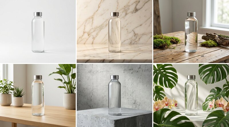
3. Shot Type Selection
Use the same shot types across all your products. If every product gets a hero white background, a lifestyle in-use shot, and a detail macro, customers subconsciously recognise the pattern as "your brand's visual language."
Platform-Specific Consistency
Amazon
Amazon demands pure white backgrounds for main images. Use AI to ensure every single product meets the RGB 255,255,255 standard - no grey tints, no shadows on the background. Consistency here prevents listing suppressions.
Shopify / Your Own Store
Your own store gives you the most freedom. Set your brand colours and style preset, then batch-generate all products with the same configuration. The result is a store that looks like it had a professional brand photoshoot.
Instagram / TikTok
Social media rewards visual cohesion. A consistent Instagram grid - same colour tones, same styling approach, same quality level - dramatically improves follower conversion and engagement.
Common Consistency Mistakes
- Mixing manual and AI photos: The quality difference is obvious. Either go all-AI or invest in matching your AI output to your existing photography style.
- Changing presets between batches: Pick one style and commit. Switching from Minimalist to Rustic mid-catalogue is jarring.
- Ignoring lighting direction: AI generates consistent lighting, but if your input photos have wildly different lighting, results may vary. Shoot all source images in similar conditions.
- Forgetting mobile: 70%+ of shoppers browse on mobile. Your consistency needs to hold at small screen sizes.
The Consistency Checklist
- Set brand colours in your AI tool (save as account default)
- Choose one style preset for your entire catalogue
- Define 5-8 standard shot types that every product receives
- Process similar products in batches for added consistency
- Review all images at thumbnail size before publishing
- Re-generate any outliers that don't match your visual standard
ShopShot makes brand consistency automatic. Set your colours once, pick a style preset, and every product you process matches your brand identity. Try it free with 15 credits.
Frequently Asked Questions
How do I maintain consistent product photos across platforms?
Set brand colours in your AI tool, choose one style preset, and use the same shot types for every product. Process similar products in batches and review all images at thumbnail size before publishing.
What are brand colours in AI product photography?
Brand colours are your company's colour palette that gets embedded into AI-generated images. When set, lifestyle backgrounds, props, and accent elements incorporate your brand's primary, secondary, and accent colours.
How do style presets affect product photography?
Style presets define the overall mood and aesthetic of generated images - lighting style, background textures, colour grading, and composition approach. Options include Minimalist, Luxury, Rustic, Scandinavian, and more.
Does inconsistent photography really affect sales?
Yes, brands with consistent presentation across platforms see revenue increases of up to 23%. Inconsistent imagery reduces trust and perceived quality, directly impacting conversion rates.
Ready to Transform Your Product Photography?
Try ShopShot free and see professional AI photography in action.
Start Free - 15 Credits